Key Takeaways
What is a high-converting landing page?
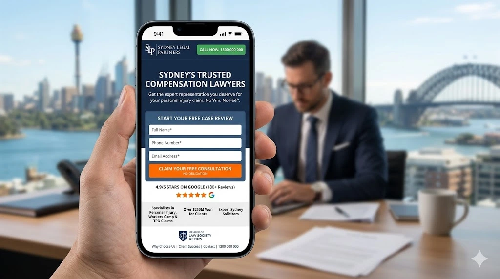
A high-converting landing page is a standalone web page built around one single goal. It uses psychological principles, clear copy, and trust signals to guide visitors toward one specific action. In 2026, the median dedicated landing page conversion rate is 4.02%, while top-quartile pages exceed 11.45%, according to the Unbounce 2026 Conversion Benchmark Report (analysis of 44 million conversions).
Why does psychology matter for landing page conversions?
Because people do not make decisions with pure logic. They use emotions, social cues, and cognitive shortcuts. When your landing page aligns with how the brain naturally works, conversions go up.
What are the biggest conversion killers?
Slow load times, unclear headlines, too many form fields, weak trust signals, and missing social proof. Fix these and most landing pages significantly improve results.
Who Is This Guide For?
This guide is for you if you are:
- A Sydney small business owner running Google or Meta ads
- A digital marketer looking to improve CRO for Australian clients
- A founder whose landing page gets traffic but few leads
- An agency building pages for lead generation services in Australia
- A developer who wants to understand landing page design psychology
Why Most Landing Pages in Sydney Are Leaving Money on the Table
Most Sydney businesses spend thousands on Google Ads every month. The traffic arrives. Then it bounces.
The problem is almost never the ad. It is the landing page.
The gap between a page converting at 2% and one at 14% is not a design gap. It is a psychology gap. The businesses winning right now are the ones who built their pages around how people actually make decisions.
Here are the verified facts for 2026:
| Metric | 2026 Verified Data | Source |
| Median dedicated landing page conversion rate | 4.02% | Unbounce 2026 Conversion Benchmark Report |
| Top 25% of landing pages | 11.45%+ | Unbounce 2026 Conversion Benchmark Report |
| 3-field forms vs 9-field forms | 10.1% vs 3.6% conversion | Unbounce 2026 Form Analysis |
| Reducing fields from 11 to 4 | 120% conversion increase | HubSpot research |
| Companies with 40+ landing pages vs fewer than 5 | 500%+ more conversions | HubSpot blog research |
| A/B testing average conversion improvement | 37–49% | HubSpot / Invesp |
Primary sources used throughout this article:
- Unbounce 2026 Conversion Benchmark Report — 44 million conversions analysed
- HubSpot Marketing Blog — CTA, form, and landing page studies
- Google web.dev / Core Web Vitals — Page speed research
- Invesp Conversion Optimization Research — Social proof and A/B testing data
- Wyzowl Video Marketing Statistics 2026 — Video conversion data
- EyeView Digital Case Studies — Video landing page case study
- Australian Competition and Consumer Commission (ACCC) — Consumer trust guidelines
- Australian Communications and Media Authority (ACMA) — Digital marketing compliance
How Does First Impressions Psychology Affect Landing Page Conversions?
Your visitor forms a judgment in under 50 milliseconds. Before they read a single word, they have decided whether they trust you. This is why visual hierarchy matters so much on a landing page — your design communicates credibility before the copy ever gets a chance.
For Sydney businesses, local relevance matters immediately. A generic stock photo reduces trust. A real photo of your team in your suburb builds it fast.
What to do in your first impression section:
- Use a headline that speaks directly to the visitor’s specific problem
- Show a real photo, not a stock image from a global library
- Include one trust signal above the fold — a Google Reviews badge, award, or media mention
- Keep the hero section free of clutter and competing messages
The F-pattern reading behaviour, documented by Nielsen Norman Group in their eye-tracking research, shows visitors scan left-to-right across the top then down the left side. Place your most important copy and CTA along that natural reading path.
What Is the Role of Cognitive Bias in Landing Page Design?
Cognitive biases are mental shortcuts the brain uses to make faster decisions. Smart landing page psychology uses these biases to reduce friction and increase conversions.
Here are the most powerful ones and how they work in practice:
Loss Aversion
Nobel Prize-winning research by Daniel Kahneman and Amos Tversky shows people feel losses roughly twice as intensely as equivalent gains. “Don’t lose another lead” hits harder than “Get more leads.” Frame your offer around what the visitor stands to lose by not acting.
The Scarcity Principle
Limited availability increases perceived value. “Only 3 spots left this month” is not manipulation when it is true. It is honest signalling that your service is in demand. Used dishonestly, it permanently destroys trust.
Authority Bias
People defer to experts. Logos of media outlets, industry certifications, and recognised awards trigger authority bias automatically and measurably.
Reciprocity
Give something first. A free audit, a useful checklist, or a genuine industry insight creates a psychological obligation to reciprocate. This is why lead magnets work so well for landing page conversion optimization in competitive markets.
Social Proof
Humans look to others when uncertain. According to Invesp’s research, social proof elements including testimonials, reviews, and trust badges increase landing page conversions by 34% on average. A Sydney business owner is more likely to trust you if they see testimonials from other Sydney business owners by name.
How Does Visual Hierarchy Guide Visitors Toward Conversion?
Visual hierarchy is the arrangement of elements so the eye moves in a deliberate sequence. A poorly structured page forces the visitor to figure out where to look. That cognitive load kills conversions.
The most effective landing page layout follows this order:
- Headline — Your biggest, boldest statement. One sentence. One promise.
- Sub-headline — Expands on the headline with specificity.
- Hero image or video — Reinforces the message visually.
- Trust signals — Logos, badges, star ratings.
- Benefits section — What the visitor gains, not what you sell.
- Social proof — Testimonials, case studies, star ratings.
- CTA — Clear, singular, repeated at natural scroll intervals.
Tools like Hotjar and Microsoft Clarity show exactly where visitors look and where they drop off. Use heatmaps and scroll maps before changing anything. Data beats guesses every single time.
What Are Trust Signals and Why Do They Matter for Australian Visitors?
Trust is the single biggest conversion lever most businesses ignore. Australian consumers are sceptical by nature. They need proof before they act.
Trust signals are any elements that reduce perceived risk in the visitor’s mind. Here is what works for Australian audiences in 2026:
High-Impact Trust Signals:
- Google Reviews badge with current star rating and review count
- Industry certifications relevant to your field (AIIA, AMA, relevant trade associations)
- Real testimonials with full name, business name, suburb, and photo
- Media mentions (“As seen in The Australian, SMH, or ABC Business”)
- Money-back guarantees or risk-free consultation offers
- Australian Business Number (ABN) displayed visibly
- Physical Sydney address — critical for local SEO trust signals
- SSL certificate and secure payment indicators
One thing most competing posts miss: specificity in testimonials multiplies their impact. “Great service” converts poorly. “We went from 12 leads a month to 47 in the first 6 weeks working with this team” converts well. Seek out specific numbers from every satisfied client.
How Does Copywriting Psychology Drive Higher Conversions?
Conversion-focused copywriting is not about being clever. It is about being clear.
Most landing page copy is written for the business, not the visitor. It talks about “our team,” “our services,” and “our values.” The visitor does not care about any of that. They care about their own problem.
The shift from “we” to “you” is the most underused conversion tactic in Australian digital marketing.
Principles of Conversion Copywriting:
- Write the headline for one specific person. Your ideal customer. Not everyone.
- Lead with the problem, not the solution. Show you understand their pain first.
- Use simple language. Unbounce’s 2026 Conversion Benchmark Report found that simple copy converts at 5.3%, while college-level writing converts at only 2.2%. Readability directly drives revenue.
- Be specific. “Increase revenue” is vague and forgettable. “Add $3,000 a month in new leads” is specific and memorable.
- Use active voice. “We build your page” beats “Your page will be built.”
HubSpot’s study of 330,000+ CTAs found that personalised calls-to-action convert 202% better than generic defaults (source: HubSpot Marketing Blog). The difference between “Submit” and “Get My Free Sydney Quote” is not trivial — it is the difference between a 1% conversion rate and a 3% one.
Does Page Load Speed Really Affect Landing Page Conversions?
Yes, dramatically. And this is one area where Sydney businesses consistently fall short.
According to Google’s Core Web Vitals research published at web.dev, a one-second delay in mobile load time reduces conversions measurably at every stage. Rudys.ai’s 2026 analysis of multiple data sources found that sites achieving sub-second loads see 9.6% conversion rates versus just 3.3% for pages loading in 5 seconds — a 191% performance gap.
2026 Speed Benchmarks (Source: Google, HubSpot, Rudys.ai aggregate):
| Load Time | Conversion Rate Impact |
| Under 1 second | 9.6% median conversion |
| 1–2 seconds | Minimal additional drop |
| 3 seconds | 32% higher bounce rate vs 1-second benchmark |
| 5 seconds | 3.3% median conversion — 191% below sub-second pages |
| 6+ seconds | Majority of mobile visitors abandon before content loads |
Fix your landing page speed before anything else. Use Google PageSpeed Insights (free tool) to identify specific issues. Compress images before upload. Remove unused JavaScript. Use Australian-hosted servers or CDN edge nodes to serve content from locations close to Sydney visitors.
How Does Form Design Affect Conversion Rate Optimization?
Forms are where conversions die. Most landing pages ask for too much information too soon.
The data is clear and verifiable. According to the Unbounce 2026 Conversion Benchmark Report (analysis of landing page form data), three-field forms convert at 10.1% while nine-field forms drop to 3.6%. That is a 65% reduction in leads from adding extra fields. Separately, HubSpot’s research found that reducing form fields from 11 to 4 increases conversions by 120% (source: HubSpot).
Landing Page Form Optimisation Rules:
- Ask only for what you absolutely need at this specific stage
- Use a single-column layout — easier to complete on mobile
- Replace “Submit” with a benefit-driven label (“Get My Free Audit”)
- Show a brief privacy statement near the submit button
- Use inline validation to reduce frustration from errors
- Consider multi-step forms for complex offers — Unbounce’s 2026 data shows multi-step forms convert 21% better than single-page forms with the same total number of fields
For Sydney professional services businesses specifically, name, email, and phone is a consistently high-converting three-field combination. Everything else can be gathered in the follow-up call.
What Is the Psychology Behind Effective CTA Button Design?
Your call-to-action button is the most important element on the landing page. Everything else exists to get the visitor to click it.
Most businesses treat their CTA as an afterthought. They pick a colour, write “Submit,” and move on. This is an expensive mistake.
CTA Placement Strategy:
Repeat your CTA at least three times on a standard landing page. Once above the fold. After your benefits section. Once at the bottom after social proof. Unbounce data shows that landing pages with a single focused CTA convert at 13.5%, while pages with 5 or more links drop to 10.5%.
Colour Psychology for CTAs:
- Orange and red create urgency and prompt action
- Green signals permission and forward momentum
- Blue signals trust but can feel passive for action steps
- Contrast matters more than colour theory — your CTA must visually stand out from the background at a glance
CTA Copy That Converts:
- “Start My Free Trial” — personal, specific, low-risk commitment
- “Get My Free Sydney SEO Audit” — local, valuable, and free
- “Yes, I Want More Leads” — positive framing in first person
- “Reserve My Spot” — scarcity framing, personal ownership
HubSpot’s landmark study of 330,000+ CTAs confirmed that personalised calls-to-action outperform generic ones by 202% (source). Test your CTA copy regularly using tools like Google Optimize or Unbounce’s built-in A/B testing.
How Does Social Proof Build Credibility on Landing Pages?
Social proof is the psychological phenomenon where people assume the behaviour of others reflects the correct choice. It is why we check reviews before buying anything online.
On a landing page, social proof reduces the fear of making the wrong decision. According to Invesp’s conversion research, social proof elements increase landing page conversions by 34% on average. A separate analysis cited in Genesys Growth’s 2026 CRO report found that displaying reviews can boost conversions by up to 270%, attributed to Keywords Everywhere data.
Types of Social Proof That Convert:
- Client testimonials with photo, full name, company, and a specific measurable outcome
- Video testimonials — EyeView case study research, cited by Smart Insights, found that adding video to landing pages increased conversions by 80–86% depending on the offer type (source: Smart Insights)
- Star ratings from Google or Trustpilot — verified, public, and trusted by Australian consumers
- Case studies with before and after metrics and a clear timeline
- Client logos from recognisable local or national companies
- User counts (“Join 4,200 Sydney business owners”)
The key insight most Sydney businesses miss: testimonials work best when they mirror the exact fears and objections your visitor has right now. If your visitor is worried about price, show a testimonial that directly addresses value for money.
What Is Attention Ratio and Why Does It Matter?
Attention ratio is the number of actions a visitor can take on your page divided by the single conversion goal. The ideal ratio is 1:1.
Every link, menu item, and additional offer dilutes focus. According to HubSpot’s own A/B testing of their landing pages, removing navigation links from a page measurably increased conversion rates in their direct comparison test (source: HubSpot blog).
Landing pages must remove all navigation. No header menu. No footer links to your blog. Nothing that creates an escape route away from the single conversion goal.
This is the core difference between a standard website page and a true landing page. A website serves many goals. A landing page serves exactly one.
How Does Urgency and Scarcity Influence Decision-Making?
Urgency and scarcity tap directly into loss aversion — documented in Nobel Prize-winning research by Kahneman and Tversky. When people believe something is about to disappear, they act faster.
Used honestly, scarcity is one of the most effective conversion tools available. Used dishonestly, it destroys trust permanently and, in Australia, may breach ACCC consumer guidelines on misleading representations (ACCC: Making claims about your products).
Legitimate urgency tactics:
- Real deadline-based offers tied to actual events (“End of financial year pricing closes 30 June 2026”)
- Genuine limited availability (“Taking 3 new clients in July — 1 remaining”)
- Seasonal pricing aligned with real business cycles
- Event-based triggers tied to verifiable conditions
Sydney consumers are sophisticated. Fake countdown timers that reset on page reload get noticed. The psychology of urgency works best when it is tied to a genuine constraint.
How Do You Use A/B Testing to Improve Landing Page Performance?
A/B testing compares two versions of a page to determine which converts better. It removes opinion and replaces it with evidence.
Despite its proven value, only 17% of marketers A/B test regularly, according to Cropink 2026 data cited across multiple industry reports. Yet companies that do test systematically see 37–49% higher conversion rates on average, per HubSpot and Invesp research.
What to test first (in order of measurable impact):
- Headline copy — the single highest-impact variable on any landing page
- Hero image or explainer video vs. no video
- CTA button text and colour contrast
- Form field count — test 3 fields vs 5 fields
- Social proof placement — above vs. below the CTA
- Page length — short single-screen vs. long-form scrolling page
Verified testing tools with honest assessments:
| Tool | Strength | Limitation | Approx. AUD Cost |
| Unbounce | Purpose-built for landing pages, strong A/B feature set | Higher cost for small budgets | From ~$150/month |
| HubSpot | Excellent CRM integration, built-in testing | Complex to set up initially | Free to ~$55/month |
| Google Optimize | Free, integrates natively with GA4 | Basic feature set | Free |
| VWO | Advanced multivariate testing, strong reporting | Overkill for most SMBs | From ~$200/month |
| Hotjar | Session recordings, heatmaps, form analytics | No A/B testing built in | Free to ~$120/month |
| Microsoft Clarity | Free heatmapping, rage click and scroll tracking | Fewer advanced features | Free |
Run each test for a minimum of two weeks. Ensure you have reached statistical significance before declaring a winner. A test based on 50 visitors tells you nothing reliable.
What Is the Role of Mobile Optimisation in Landing Page Conversion?
According to Unbounce’s Q4 2024 benchmark data, mobile accounts for 82.9% of landing page traffic, yet desktop still converts 8% better on average. This is the “mobile paradox” — most of your visitors are on mobile, but they convert at lower rates due to screen limitations, form friction, and payment complexity.
The answer is not to ignore mobile. It is to make your mobile landing page as frictionless as possible.
Mobile Landing Page Essentials for Sydney Businesses:
- Tap targets at least 44×44 pixels — fingertip-friendly buttons throughout
- Font size minimum 16px for all body text
- Single-column layout — no side-by-side content blocks
- Click-to-call phone number visible above the fold
- Form fields that trigger the correct keyboard type (email field opens email keyboard)
- Images compressed to WebP format for faster Australian mobile network loading
- No pop-ups or interstitials that cover the main content on mobile
Google’s web.dev documentation states that 53% of mobile visitors abandon a page that takes longer than 3 seconds to load. For Sydney businesses relying on NBN connections with variable speeds, this is a real and measurable problem worth fixing before any design work.
What Are the Most Common Landing Page Mistakes That Reduce Conversions?
Here are the most expensive and common mistakes Sydney businesses make repeatedly:
1. Headline mismatch with the ad
If your Google Ad says “Sydney Plumber — Free Quote Today” and the landing page headline says “Welcome to ABC Plumbing Services,” conversions drop immediately. The message must match the ad precisely. This is called message match and it is one of the most impactful quick fixes available.
2. Serving too many audiences on one page
A single landing page cannot speak equally to a tradie in Penrith and a lawyer in the CBD. Build separate pages for separate audiences and separate services.
3. Burying the CTA below the fold
Requiring the visitor to scroll three screens before they can contact you is a conversion killer. The CTA should be visible in the first screen.
4. Using industry jargon
Technical terms create cognitive friction. Plain language always outperforms technical language with general audiences. Unbounce’s readability research confirmed that difficult words have a more negative impact on conversion than at any prior point in their dataset.
5. No real mobile testing
Testing in a browser emulator is not the same as testing on an actual iPhone or Android device. Things render and break differently on real hardware. Always test on three real devices minimum before launching.
6. Ignoring page speed
A beautiful landing page that takes 7 seconds to load on a Sydney user’s mobile connection is effectively worthless. Speed is not a technical nicety — it is a direct revenue lever.
7. Weak or unspecific social proof
“We are Sydney’s best digital agency” means nothing and is legally questionable under ACCC advertising guidelines. “47 verified 5-star Google reviews from Sydney clients” is verifiable and trustworthy.
How Does the Conversion Funnel Relate to Landing Page Psychology?
A conversion funnel is the sequence of steps between a visitor arriving and completing your desired action. Landing pages sit at a critical stage of that funnel — typically the moment when paid traffic meets your offer.
Understanding funnel psychology means matching your landing page to where the visitor actually is in their decision process.
Funnel Stage Matching:
| Funnel Stage | Visitor Mindset | Landing Page Focus |
| Awareness | “I have a problem” | Educate. Address pain points clearly. |
| Consideration | “What are my options?” | Compare. Show your key advantages. |
| Decision | “Should I choose you?” | Trust signals. Testimonials. Guarantee. |
| Action | “I am ready to go” | Clear CTA. Remove all friction. |
Most Sydney businesses send all paid traffic to a decision-stage landing page, but many of those visitors are still in the consideration stage. The result is high bounce rates and confused visitors. Customer journey mapping — available as a feature in HubSpot and as a process within Google Analytics 4 — helps identify exactly where your audience is when they click your ad.
What Is Decision Fatigue and How Does It Affect Landing Pages?
Decision fatigue is the deterioration of decision quality after a person makes repeated choices. On a landing page, every element that requires a decision uses up mental energy.
By the time a fatigued visitor reaches your CTA, they may have depleted their decision-making capacity and simply leave.
Reduce decision points deliberately:
- One offer (not three different packages side by side)
- One primary CTA (not five competing buttons)
- One contact method prominently featured
- One page goal (not “buy, subscribe, or follow us on Instagram”)
Hick’s Law in psychology confirms: the more choices you give someone, the longer they take to decide — and the more likely they are to abandon the decision entirely. Shopify applies this well by highlighting one pricing plan as “Most Popular,” reducing choice paralysis for new visitors.
Frequently Asked Questions About Landing Page Psychology
What is a good landing page conversion rate for Sydney businesses in 2026?
The median dedicated landing page conversion rate across industries is 4.02% in 2026, per the Unbounce 2026 Conversion Benchmark Report (44 million conversions). Top-quartile pages exceed 11.45%. For Sydney local businesses using Google Ads, a rate of 5–8% is considered strong performance. Legal services and professional services can realistically target 7–10% with well-optimised pages that include strong local trust signals.
How many landing pages should a Sydney business have?
HubSpot’s research found that companies with more than 40 landing pages generate over 500% more conversions than those with fewer than 5 pages (source). Even moving from fewer than 10 to 10–15 pages produces a 55% increase in leads. For Sydney businesses, create separate pages for each service, each suburb you target, and each audience type.
How long should a landing page be?
It depends on the offer. For simple lead capture — free audit, quote request, callback — short pages of 400–600 words convert well. For higher-commitment offers such as courses, consulting packages, or high-ticket services, longer pages that address more objections perform better. Always test both formats with your specific audience and traffic source.
Does adding video to a landing page improve conversions?
Yes, meaningfully. An EyeView Digital case study, cited by Smart Insights, found that adding video to landing pages increased conversions by 80–86% (source). Unbounce data cited in Levitate Media’s 2026 video statistics report puts the figure at up to 80%. Keep videos under 90 seconds. Open with the specific problem. Present your solution. End with a direct next step.
What headline formula works best for landing pages?
The most consistently tested format is: [Specific Outcome] for [Specific Audience] in [Specific Timeframe]. Example: “47 New Leads Per Month for Sydney Service Businesses — Guaranteed.” Specificity builds trust. Vague headlines reduce it. Test your headline first — it is the single highest-impact variable on any landing page.
How does colour psychology affect CTA button performance?
Colour contrast matters more than colour meaning. Your CTA button must visually stand out against the page background. A Performable (now HubSpot) case study found a red CTA button outperformed a green one by 21% in a direct A/B test. Orange drives urgency. Green signals forward movement. Always A/B test with your specific audience because results vary significantly by industry and audience demographic.
Why do landing pages with social proof outperform those without?
Social proof reduces the uncertainty of making a new purchasing decision. According to Invesp’s conversion research, social proof elements increase conversions by 34% on average. For Australian consumers, who are particularly sceptical of online marketing claims, verifiable Google Reviews and named testimonials with specific results address the most common conversion-blocking objection — “Can I trust this company?” — before the visitor consciously forms it.
What is the ideal number of form fields for a landing page?
Three fields is the sweet spot, according to the Unbounce 2026 Conversion Benchmark Report. Three-field forms convert at 10.1% while nine-field forms drop to 3.6%. Separately, HubSpot’s research found reducing fields from 11 to 4 increases conversions by 120% (source: HubSpot). For Sydney lead generation pages, name, email, and phone is a high-converting standard combination.
How often should I run A/B tests on my landing page?
Continuously. CRO is not a one-time project. Despite the proven 37–49% average conversion improvement from regular testing, only 17% of marketers A/B test actively, per Cropink 2026 data. After fixing the biggest blockers — speed, headline clarity, CTA — run monthly tests on secondary elements. Businesses that test consistently compound their conversion improvements over time.
What makes a landing page rank in Google in Sydney?
Local SEO landing pages need location-specific keywords in the headline, body, and meta data; a Sydney address and ABN visible on-page; local testimonials mentioning specific Sydney suburbs; structured data markup (LocalBusiness schema); fast mobile load times; mobile-first design; and backlinks from Australian websites. Google’s local ranking algorithm rewards clear relevance and proximity signals. For official digital marketing compliance in Australia, refer to the ACCC guidelines on advertising.
How important is page speed for Australian landing pages?
Critical. Australian NBN connection speeds vary significantly between connection types and suburbs. Test your page speed from Australian server locations using Google PageSpeed Insights. Aim for a Largest Contentful Paint (LCP) under 2.5 seconds on mobile, per Google’s Core Web Vitals guidance at web.dev. Rudys.ai’s 2026 aggregate analysis found that pages loading in under one second convert at 9.6% versus 3.3% for 5-second pages.
What is the Fogg Behaviour Model and how does it apply to landing pages?
The Fogg Behaviour Model, developed by Stanford researcher BJ Fogg, states that behaviour occurs when three elements converge simultaneously: motivation (a reason to act), ability (ease of taking the action), and a trigger (a prompt at the right moment). A landing page must deliver all three. The benefits section and social proof create motivation. A short form and simple process create ability. The CTA button is the trigger. Remove any one of these and conversions measurably decline.
A Practical 2026 Landing Page Checklist for Sydney Businesses
Use this before you launch any new landing page:
Psychology and Copy:
- Headline addresses a specific pain point or desire
- Copy speaks to the visitor’s goals, not the business’s features
- Benefits listed throughout, not just product or service features
- Loss aversion framing used at least once in the copy
- Scarcity is genuine and the reason is clearly explained
Trust and Social Proof:
- Minimum three testimonials with full name, suburb, and photo
- At least one testimonial with a specific, measurable outcome
- Star ratings from Google or Trustpilot visible near the CTA
- Industry certifications or media mentions displayed
- Sydney location and ABN clearly visible on the page
Design and UX:
- Navigation completely removed from the page
- Primary CTA visible without scrolling on desktop and mobile
- CTA repeated at least three times on a full-length page
- Page tested on at least two real mobile devices before launch
- Single conversion goal — no competing CTAs or exit links
Technical:
- Page LCP under 2.5 seconds on mobile (tested via Google PageSpeed Insights)
- HTTPS enabled with valid SSL certificate
- Google Analytics 4 and Microsoft Clarity installed and verified
- A/B test variant ready to run alongside from day one
- Heatmap tracking active from launch day to collect early behaviour data
Conclusion: The Psychology Is Not Complicated. The Discipline Is.
The best-converting landing pages in Sydney are not the most beautiful. They are not the most complex. But they are built around how people actually think and decide.
They address real fears before the visitor consciously forms them. And show genuine proof from real people. They make the next step feel obvious, safe, and low-risk. They speak to one person, with one message, and one clear action.
The psychology principles covered in this guide — loss aversion, social proof, cognitive bias, visual hierarchy, form friction, decision fatigue — are well-documented in peer-reviewed research and verified across tens of millions of real conversion data points from Unbounce, HubSpot, Google, and Invesp.
What is hard is not understanding the psychology. What is hard is the discipline to remove everything that does not serve the single conversion goal.
Start with the checklist above. Fix the headline. Remove form fields that do not serve qualification. Add specific, named social proof. Test the CTA. Measure with heatmaps from day one.
You do not always need a full redesign. You need psychology working for your visitor, not against them.
What does your current landing page do in the first five seconds to reduce doubt and build trust? That one question is worth examining right now.
2026 Conversion Technology Watch
Several emerging technologies are reshaping landing page performance in Australia right now:
AI-Powered Behavioural Personalisation
Landing pages that adapt headlines, imagery, and CTA copy in real time based on the visitor’s traffic source, location, and on-site behaviour. HubSpot’s Breeze AI and Mutiny are two platforms already deploying this at scale for Australian clients.
Conversational Multi-Step Forms
Multi-step interactive forms that feel like a natural conversation rather than a questionnaire. Unbounce’s 2026 data shows multi-step forms convert 21% better than single-page forms with the same total fields, making this a meaningful upgrade for complex service offers.
Voice and AI Search-Optimised Landing Pages
As voice assistant and AI search tool usage grows across Sydney households, landing pages written in natural conversational language (“emergency plumber Surry Hills available now”) are gaining measurable local search advantage.
Real-Time Social Proof Notifications
Live activity widgets showing recent bookings or enquiries from verifiable sources. Note: these must comply with ACCC guidelines on accurate representations — fabricated notifications breach Australian consumer law.
Privacy-First Personalisation Post-Cookie
With third-party cookies fully deprecated across major browsers, first-party data strategies are now central to landing page personalisation. Digital Applied’s 2026 benchmark data found that first-party data audiences convert four times higher than cold traffic, making email list quality and CRM data a direct conversion asset.
All statistics are sourced from published industry reports and verified primary sources. Key references: Unbounce Conversion Benchmark Report, HubSpot Marketing Research, Google web.dev Core Web Vitals, Invesp CRO Research, Wyzowl Video Marketing Statistics 2026, EyeView/Smart Insights video case study, ACCC advertising guidelines, ACMA digital compliance. Data updated June 2026.


0 Comments